Subscription pay-wall trial experimentation for Acrobat Reader
Role
Product Designer
Company
Toaster
Timeline
October 2022
Team
3 Designers + 4 Engineers

Key Takeaways 🏆
This redesign of Bitpanda’s onboarding experience led to a significant reduction in drop-off rates, a smoother user journey, and improved first-time investment conversion. By identifying friction points, simplifying key steps, and improving clarity, we helped more users successfully complete their onboarding. This case study details how research, iterative design, and strategic optimizations led to these results.
Context
The App
As we all know, Adobe Acrobat Reader is a widely-used application for viewing, creating, manipulating, printing, and managing PDF files.
The App works on a subscription basis with exclusive access to the most useful tools on the product. On its free version, you can still make some edits to your file.
Problem Framing
The free-wall paywall in Adobe Acrobat Reader had low conversion rates, with many users abandoning the process upon encountering the paywall.
The design was not user-friendly, leading to a poor user experience that failed to clearly communicate the benefits of upgrading to the premium version. This resulted in missed opportunities for revenue growth and user retention.
Growth Approach
Dynamic
We formulated hypotheses around user behavior and paywall interactions, creating 5+ distinct tests to validate these hypotheses. Each experiment provided insights that informed the following iterations. This allowed us to optimize the paywall, ensuring each version was more effective than the last.
By continuously refining our design based on real user feedback and performance metrics, we aimed to maximize conversion rates and user satisfaction.
Principles
1. It all starts with data
2. Prioritize highest impact
3. Draw many hypothesis
4. Speed of iteration
5. Decode results
Solution
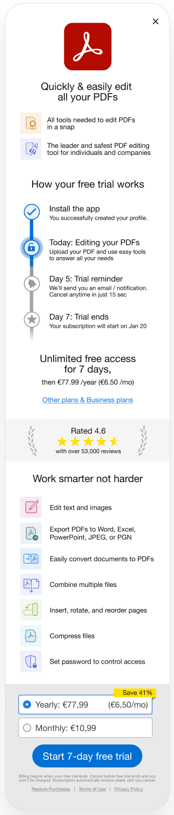
Before
After

What was added
App logo
Adobe's brand is the app's main leverage versus other competitors. Nudging the user to opt for the most renown experience against a cheaper alternative is an experiment worth running by having the logo present.
Timeline
To act on the number of drop-offs on the pay-wall, we give the user peace of mind inlcuding a trial notification reminder and a clear overview of the offer.
Social proof
Showing the app's rating and amount of reviews.
Features Icons
Clear visual representation of the features offered after the pay-wall. Ensure user's recognition of them by the icons instead of reading each description.
For the future
What didn’t go as planned
The lack of direct communication with the development team meant that some design decisions had to be revisited due to technical constraints we were unaware of.
To address these challenges in future projects, I established regular meetings and a Slack channel for a more integrated communication between design and the development team.
Further experiments
Personalized Paywall Messaging
Use User data to argument which benefits they could have, like: Amount of documents finished, amount of documents signed, time saved on Acrobat vs other editing tools, etc.

