Minimizing onboarding drop-off for Bitpanda's app
Role
Product Designer
Company
Bitpanda
Timeline
August 2023
Team
PO, FE Eng, UX Writter

Key Takeaways 🏆
This redesign of Bitpanda’s onboarding experience led to a significant reduction in drop-off rates, a smoother user journey, and improved first-time investment conversion. By identifying friction points, simplifying key steps, and improving clarity, we helped more users successfully complete their onboarding. This case study details how research, iterative design, and strategic optimizations led to these results.
Problem
We have adopted building fast with AI. However, designers know this puts a spotlight on the speed <> quality dilema.
Knowing speed wasn't negotiable in an engineering led-company, my goal was to achieve the highest quality AI output possible. With Claude Code in the codebase, Figma through MCP, Claude design and other tools for prototyping on the side, we had good bases to build a good workflow.
However, our design system didn't have enough context for the LLMs to know how to behave around them.
Introduction
For many first-time investors, signing up for a trading platform can be a daunting process. Bitpanda recognized that a high number of users were dropping off before completing onboarding, preventing them from engaging with the platform. Our challenge was to redesign and optimize the onboarding flow to create a seamless experience, reducing friction and increasing activation rates.
💬 Problem Statement
Despite strong market interest, Bitpanda faced high drop-off rates in the onboarding process. We identified key challenges:
Users abandoned onboarding before completing verification.
The process had 50 screens, making it feel too lengthy.
Key information was unclear or overwhelming, causing hesitation.
🤓 Constraints & Considerations
Regulatory Compliance: The onboarding process required identity verification (KYC), which added friction.
Maintaining Security & Trust: Any changes had to ensure users still felt safe and informed about their financial commitments.
Insights analysis
The client provided information on recently done surveys and interviews. We crossed referenced this data with our own audit and analysis to understand where and why users were dropping off.
Users struggled with identity verification. Many found the process unclear and abandoned it.
Too many steps led to frustration. Users wanted a quicker, more streamlined process.
Lack of real-time guidance caused confusion. People hesitated when unsure about required documents or steps.
💡 Competitor analysis revealed that platforms with progressive disclosure (showing only necessary info step by step) and clearer guidance had higher completion rates.
User Research
Analyzed the results on the client's previous user interviews and surveys.
Design Review
Audited the existing onboarding flow and home screen layout to identify usability and visual design quality issues.
Benchmark
Researched similar investment and financial apps to gather insights on KYC best practices.

Holistic approach
All parts of the journey
Optimizing the onboarding flow was just one part of a broader strategy to enhance the overall user journey. We also considered other critical touchpoints in the user funnel, such as performance marketing, app store optimization (ASO), and external communication.
By ensuring a seamless experience across all these areas, we created a cohesive and intuitive path for users from discovery to activation. This holistic approach helped build a golden thread that connected marketing efforts with product experience.

Empathy map
As part of our research process, we crafted an empathy map to better understand user motivations and pain points at different stages of their journey. We identified three key phases: awareness, education, and the aha moment. In the awareness phase, users were asking "Why should I invest?", so we focused on addressing their hesitations with clear messaging and trust-building elements. During the education phase, where users wondered "How do I invest?", we simplified complex financial concepts and provided intuitive guidance to make investing feel approachable. Finally, the aha moment—"Where should I invest?"—was designed to seamlessly connect users with the right investment opportunities, ensuring they felt confident in taking action.
This structured approach helped us craft a more user-centric experience that aligned with real user needs.

Investment simulator
Team member
Create a FAQ
Team member
Demonstrate the loss of money without investing (inflation)
Team member
FOMO
Team member
Experts inspirational quotes for building motivation
Team member
Create a learning 101 course or hub.
Classes, quizzes, blog, glossary, videos, etc
Team member
The idea that you can start small
Team member
Create weekly performance reports
Team member
Signalize popular first buy stocks among first time traders.
Team member
Stop loss and price alert notifications
Team member
Give users some free stock to get started.
As a referral program, as amount or as a specific asset to learn from.
Team member
Crafting the solution
The task
Minimizing the number of screens
Reducing the number of steps
Rethinking the copy
Move personalization questions for a later stage
(overwhelming, they might not know what they want…)Being mindful of the real state
We focused on three key areas
Reducing friction – Eliminating unnecessary steps and simplifying the UI.
Providing better guidance – Offering real-time feedback and clearer instructions.
Enhancing mobile usability – Ensuring a seamless experience across devices.

The final design
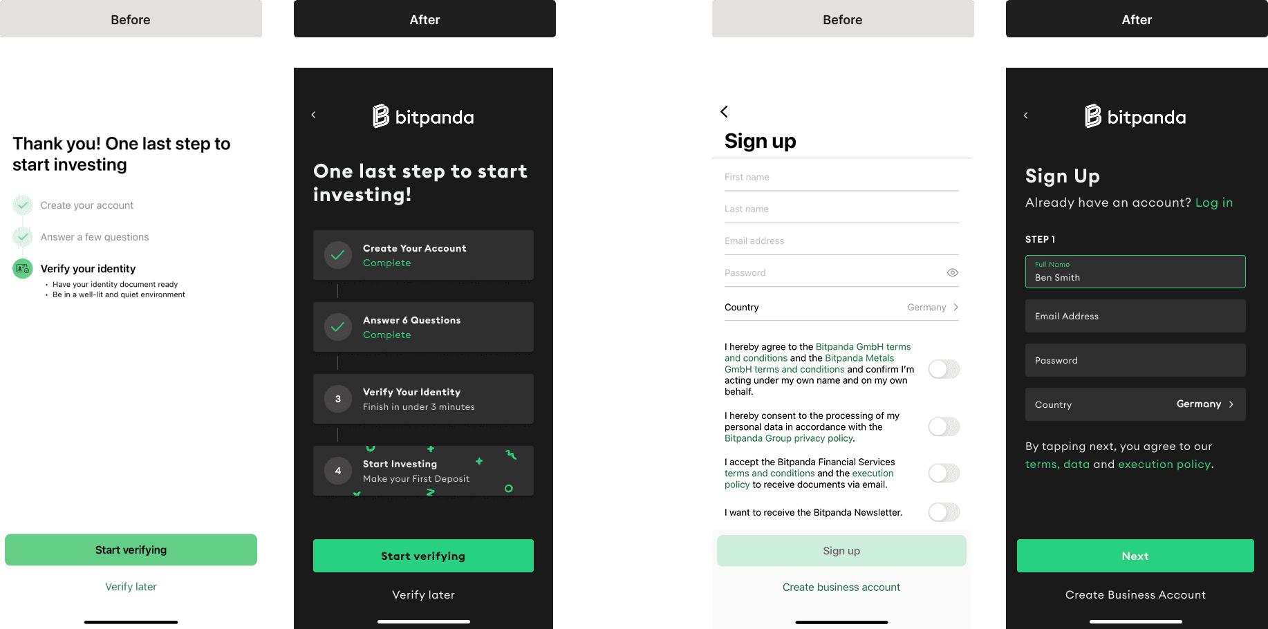
The redesigned onboarding experience featured
A simplified KYC process with clearer instructions and progress indicators.
Enhanced mobile usability, ensuring smooth navigation on all devices.
Better real-time feedback, reducing confusion and frustration.
Progressive step-by-step guidance, keeping users engaged throughout.

Extra section
Funnel improvement
The Growth Loop
This cycle of improvement, was executed by implementing a Growth Experimentation Loop, ensuring that marketing, product, and data teams worked in sync to refine the user journey.
A visual representation of this cycle will highlight how a combination of ads, app store optimization, and onboarding flow improvements contributed to a more seamless and effective acquisition and activation process.
This loop followed three key steps:
Marketing identifies opportunities – By analyzing user behavior, we detected key friction points, such as drop-offs at the sign-up stage, and opportunities for optimization through performance marketing and app store strategies.
Product builds solutions – With these insights, we designed and iterated on improvements, such as simplifying the onboarding flow to reduce friction and better align with user expectations.
Data tracks impact and gathers feedback – Every change was measured through key performance indicators like activation rates and conversion improvements, allowing us to refine strategies based on real-world impact.

Extra section
Figma illustrations

Upon conducting a thorough audit of Bitpanda's brand and online presence, a significant opportunity emerged to enhance impact through refined design and precision messaging.
Looking for an impactful appearance, I introduced the idea of experimenting in Figma with 3D vectorized designs, using vectorized shapes, masks, and strategic blurs to create a visually compelling illusion of three-dimensionality. The decision to experiment with this technique aimed to impart a contemporary aesthetic to the brand, setting it apart in a visually saturated market.
Some original assets from the product where we saw the opportunity to include these type of assets not only on promotional aspects but also within the product.


